As one of the interior architects of the cherished chain of coffee shops, Kaffebrenneriet, Sara Stølen knows how to create warm, friendly environments. She has been with the company for four and a half years and done the interior of fifteen cafés, but was up for a real challenge when the time came to open a café in the middle of the emerging steel and glass district of Bjørvika.

Decided to fill the space with Norwegian design classics
– Good interior is a place where you feel at ease, comfortable. A place to sit down for a few minutes and feel like you’ve been sitting there for hours. The lofty space of Kaffebrenneriet sits between the busy central station and the monumental opera house, with traffic on all sides throughout the day. With floor to ceiling windows and polished concrete floors, the light pours in and gives the café guests a good view of builders taking a break on the pavement outside. – We start from scratch to adapt the interior of each café to the building and its surroundings. When is it built? What used to be here? Usually this gives me a starting point. But this building was completely new.
To soften the hard, shiny, all new surfaces, Stølen decided to fill the space with Norwegian design classics. – Design from the 50s and 60s play well with the modern building. I also think it’s fun to promote Norwegian design, some of these pieces are almost forgotten about.


An object in itself
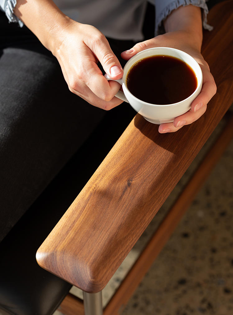
By the cube-shaped window tables, specially made from light pine wood, sets of Svein Ivar Dysthes classic 1001 AF armchairs adorn the front area of the café. Designed in 1960, the The 1001 AF armchairs are strategically placed by the large windows, to catch bypassers’ eyes.
The chair was designed in 1960 by Svein Ivar Dysthe, and is a favorite with customers and employees alike. - It’s a fantastic design classic. We wanted something that would catch people’s eye from the outside, something that was an object in itself. The sharp lines work well with the room and the large window panes. The customers love them too, it’s the café’s most popular spot.

Like a small haven
Warm materials with lots of natural wood dominates the rest of the interior; large, geometrical ceiling lamps, wooden tables with rounded edges, all specially made and designed by Stølen. You can smell the wood as you enter. – The walls are clad in wide planks of pine, to counteract the facade. We wanted something sturdy, something typically Norwegian. The natural materials makes the glass cube surprisingly cozy, well helped by walls painted in the chain’s characteristic yellow ocher. A nice contrast to the bustling traffic and building sites outside. – I want people to come inside and feel calm. That’s why we chose the natural materials: wood, fabric, leather. We hope this area will continue to grow, which means a lot of traffic. So the hope is that the café can be like a small haven, a place to sit down and have a time out.